

10 Essential MUI Components Every React Developer Should Master
Material UI (now officially called MUI) has quickly become one of the most popular React component libraries. It allows developers to build visually appealing, responsive, and professional web interfaces with clean code and consistent design.
Whether you’re a beginner learning React or a professional improving your UI/UX skills, mastering MUI can level up your development speed and product quality.
In this article, we’ll explore the 10 must-know MUI components that every React developer should master in 2025.
🎯 Why Use MUI for React?
Before diving into components, here’s why MUI stands out:
✅ Pre-built modern UI components
✅ Highly customizable with themes
✅ Excellent documentation & community
✅ Works perfectly with TypeScript
✅ Accessible and SEO-friendly

Now, let’s check out the essential components 👇
⭐ Top 10 Essential MUI Components
✅ 1️⃣ Buttons
📌 Used for actions like submit, navigation & interactivity
MUI provides:
- Contained buttons
- Outlined buttons
- Text buttons
- Icon buttons
- Loading buttons
Buttons are the core interaction elements of any app — mastering them is essential.
✅ 2️⃣ AppBar
📌 For top navigation layouts
You can easily build:
✅ Sticky headers
✅ Toolbars
✅ Brand navigation bars
✅ Search inside navbar
Perfect for dashboards and landing pages.
✅ 3️⃣ Drawer
📌 Slide-out sidebar navigation
Used widely in:
- Admin panels
- Mobile menus
- Multi-section layouts
You can pair it with AppBar for a complete navigation system.
✅ 4️⃣ Grid
📌 Layout component for responsive web design
MUI Grid helps you:
✅ Create flexible column layouts
✅ Ensure mobile responsiveness
✅ Organize sections visually
It follows the CSS Flexbox + Material Grid system.
✅ 5️⃣ Cards
📌 Best for showcasing content blocks
Examples:
- Product cards for eCommerce
- Blog preview cards
- Service cards
- Profile cards
They are visually structured and highly customizable.
✅ 6️⃣ TextField
📌 All-in-one input field component for forms
Supports:
✅ Validation
✅ Icons
✅ Password masking
✅ Autocomplete
Combined with React Hook Form, it makes powerful forms.
✅ 7️⃣ Modal / Dialog
📌 Popups for alerts, confirmations, or user forms
Used for:
- Login/signup pop-ups
- Delete confirmation
- Advance settings windows
They improve UX without redirecting the user.
✅ 8️⃣ Tabs
📌 For switching between content sections
Great for:
✅ Dashboard data
✅ Settings pages
✅ Multi-section forms
Stylish and easy to navigate.
✅ 9️⃣ Snackbar / Alert
📌 Notification system for user actions
Common for:
✅ Form submission success
✅ Errors and warnings
✅ Copy-to-clipboard messages
Keeps the UI interactive with instant feedback.
✅ 1️⃣0️⃣ Theme Provider & Typography
📌 Controls global styles & brand identity
You can customize:
🎨 Colors
🖥 Font styles
🌑 Light/Dark mode
🔳 Spacing & UI consistency
Helps you build professional-grade interfaces.
🧩 Bonus: Other Useful MUI Components
Here are quick honorable mentions:
- Table — Data display & filtering
- Chip — Tags and quick selection
- Accordion — Collapsible content
- Stepper — Multi-step forms
- Avatar — Profile images
Master them as your UI grows more advanced ✅
🛠 Tools You Need to Get Started
| Tool | Why You Need It |
|---|---|
| React + Node.js | Base framework |
| VS Code | Best coding editor |
| npm or yarn | Package installer |
| MUI Library | Main UI components |
| React Router | Navigation system |
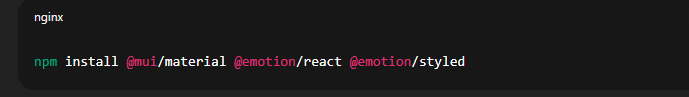
Install MUI with:
🚀 Final Thoughts
MUI gives React developers everything needed to build pixel-perfect, responsive, and user-friendly web apps — without starting from scratch.
🎯 If you master these 10 core components:
✔ Your UI development speed will increase
✔ Your projects will look professional
✔ You’ll be ready for real-world React jobs
Start building today — your next powerful UI is just a few components away!