
Using SCSS Modules with Tailwind or MUI: Best Ways to Combine Styles
Front-end styling has evolved enormously in the past decade. Today, developers rely on utility-first CSS, component-based styling, and modular SCSS — all within the same project. But when it comes to pairing SCSS Modules with Tailwind CSS or Material UI (MUI), many developers get stuck.
Do you use them together?
Do they conflict?
Which one should handle what?
Great news: YES, they can work together — beautifully — if you understand their roles.
In this guide, we’ll break down the best practices for combining SCSS Modules with Tailwind or MUI, including structure tips, real-world use cases, and examples to help you build fast, scalable, and maintainable React UI systems.
🔥 Why Combine SCSS Modules with Tailwind or MUI?
Each solution brings something powerful to the table:
⭐ Tailwind CSS
- Fast prototyping
- Utility-first
- Responsive classes
- Minimal custom CSS
⭐ SCSS Modules
- True CSS encapsulation
- Nesting, mixins, and variables
- Clean overrides
- Perfect for custom styles
⭐ MUI (Material UI)
- React component library
- Built-in theming system
- Styled API & SX prop
- Production-ready components
Using SCSS Modules alongside Tailwind or MUI allows you to get the best of both worlds:
- Tailwind/MUI for structure, spacing, layout, UI components
- SCSS Modules for unique styles, animations, overrides, and custom layouts
This hybrid strategy is incredibly effective in medium-to-large React applications.
🎨 When to Use SCSS Modules Instead of Tailwind or MUI
Use SCSS Modules when:
✔ You need custom animations
✔ You need pixel-perfect UI adjustments
✔ You want a unique branded theme
✔ Tailwind classes would get too long
✔ You need deep component-level control
✔ You want SCSS mixins, variables, or logical nesting
Example:
// Button.module.scss
.button {
  background: linear-gradient(135deg, #5f27cd, #341f97);
  padding: 12px 28px;
  border-radius: 8px;
  color: #fff;
  transition: all 0.3s ease;

  &:hover {
    transform: translateY(-2px);
  }
}
💨 When to Use Tailwind Instead of SCSS
Use Tailwind when:
✔ You need layout and spacing quickly
✔ You want consistent responsive classes
✔ You want atomic, readable CSS
✔ You don’t want to maintain large CSS files
✔ You want extremely fast prototyping
Example:
<button className="px-6 py-3 bg-indigo-600 text-white rounded-lg hover:bg-indigo-700">
  Submit
</button>
🎯 When to Use MUI Instead of SCSS
Use MUI when:
✔ You need production-ready UI components
✔ You want built-in themes, dark mode, or accessibility
✔ You want consistent spacing + design system
✔ You need tables, grids, dialogs, sliders, etc.
Example:
<Button variant="contained" color="primary">
  Save Changes
</Button>
🧩 Best Practice #1: Use Tailwind for Layout, SCSS for Custom Styling
This is the most common and recommended pattern.
React Component Example:
import styles from "./Card.module.scss";

export default function Card({ title, children }) {
  return (
    <div className={`p-6 rounded-xl shadow-md bg-white ${styles.card}`}>
      <h2 className="text-xl font-semibold mb-4">{title}</h2>
      {children}
    </div>
  );
}
SCSS Styles:
.card {
  transition: all 0.3s ease;

  &:hover {
    transform: scale(1.03);
  }
}
Tailwind handles spacing/layout while SCSS handles unique UI behavior.
🧩 Best Practice #2: With MUI, Use SCSS Modules for Overrides & Custom Elements
MUI gives excellent UI components, but sometimes you need:
- unique animations
- custom backgrounds
- layout wrappers
- marketing-site-level branding
Example:
import styles from "./Hero.module.scss";
import { Button } from "@mui/material";

export default function Hero() {
  return (
    <div className={styles.hero}>
      <h1>Welcome to Tech Academy</h1>
      <Button variant="contained" size="large">
        Get Started
      </Button>
    </div>
  );
}
SCSS:
.hero {
  background: url("/banner.png") center/cover;
  padding: 100px 40px;

  h1 {
    font-size: 3rem;
    margin-bottom: 20px;
  }
}
MUI handles the functional components.
SCSS handles the advanced aesthetics.
🧩 Best Practice #3: Keep SCSS Modules Scopes Small and Purposeful
Don’t make a 500-line module file.
Create small, component-scoped SCSS modules:
Card/
   Card.jsx
   Card.module.scss

Navbar/
   Navbar.jsx
   Navbar.module.scss
Clean, reusable, predictable.
🧩 Best Practice #4: When Using MUI, Prefer SX Prop But Allow SCSS for Complex Cases
The MUI sx prop is amazing for quick styling:
<Box sx={{ p: 3, borderRadius: 2, boxShadow: 3 }}>
  Content
</Box>
…but it is not ideal for:
❌ animations
❌ nested selectors
❌ pseudo-elements
❌ complex responsive logic
In those cases → use SCSS Modules instead.
🧩 Best Practice #5: Avoid Tailwind + MUI + SCSS All in One Component
This creates chaos.
❌ Too many style layers
❌ Hard to debug
❌ Overlapping specificity
Use this rule:
Use 2 style systems per component max.
✔ Tailwind + SCSS
✔ MUI + SCSS
✔ MUI + Tailwind (only for layout)
❌ Avoid Tailwind + SCSS + MUI together.
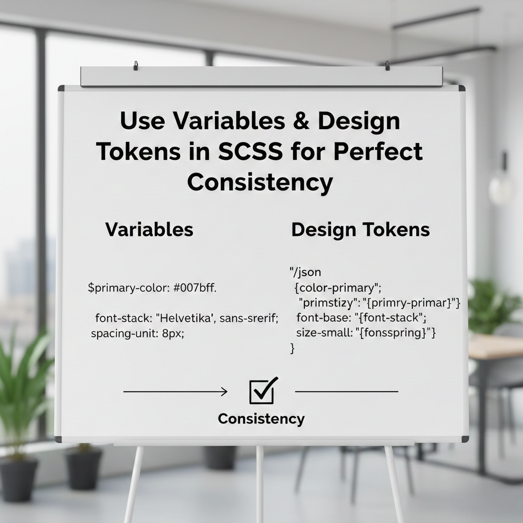
🧩 Best Practice #6: Use Variables & Design Tokens in SCSS for Perfect Consistency
If your app has a design system, store shared values:
// variables.scss
$primary: #4f46e5;
$radius: 10px;
$shadow: 0 4px 12px rgba(0, 0, 0, 0.12);
Import into modules:
@use "../styles/variables" as *;
Now your Tailwind config + SCSS tokens stay aligned.
🚀 Real-World Use Cases
1. Dashboards
- Tailwind for spacing
- MUI for tables, buttons, inputs
- SCSS for sidebar animations
2. Landing Pages
- Tailwind for layout
- SCSS for hero, gradients, transitions
3. SaaS Interfaces
- MUI for UI components
- SCSS for branding consistency
4. Marketing Sites
- Tailwind for grid + responsiveness
- SCSS for custom typography & design
🏆 Final Recommendation: The Perfect Hybrid Strategy
To keep everything clean and scalable:
1️⃣ Use Tailwind or MUI for layout + core UI
Spacing, grid, flex, typography, components.
2️⃣ Use SCSS Modules for enhancements
Animations, custom themes, visual polish.
3️⃣ Keep styles component-scoped
Helps maintain team consistency.
4️⃣ Avoid mixing all three
Stick to 2 styling systems max.
🔥 Final Thoughts
Using SCSS Modules together with Tailwind or MUI is not only possible — it’s one of the most powerful styling strategies for modern React applications.