
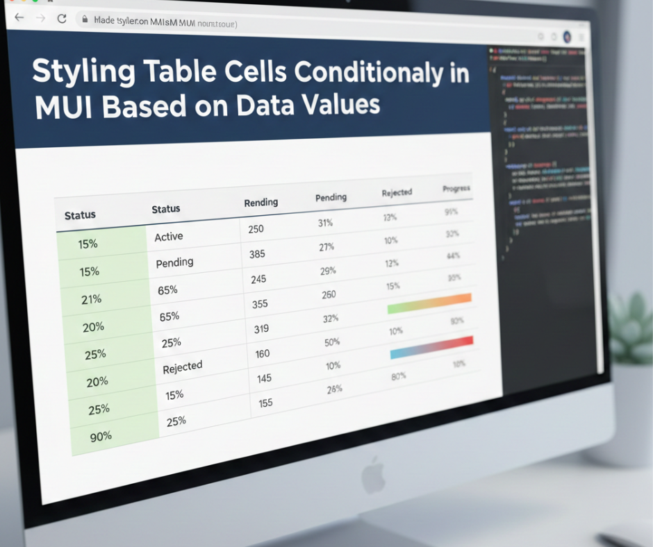
Styling Table Cells Conditionally in MUI Based on Data Values
When building interactive dashboards or data-driven applications in React, MUI (Material UI) is one of the most popular libraries for creating clean, responsive UIs. Among its components, the MUI Table is widely used for listing records, managing admin panels, showing reports, and more.
But one feature developers frequently need is conditional styling—changing the color, background, or appearance of a table cell depending on the value it contains. For example:
- Highlighting low stock items in red
- Marking high sales numbers in green
- Coloring status labels based on conditions like Active, Pending, Blocked
- Applying bold or italic styling to important rows
In this blog, we’ll explore how to conditionally style table cells in MUI using simple, clean approaches that work in any project.
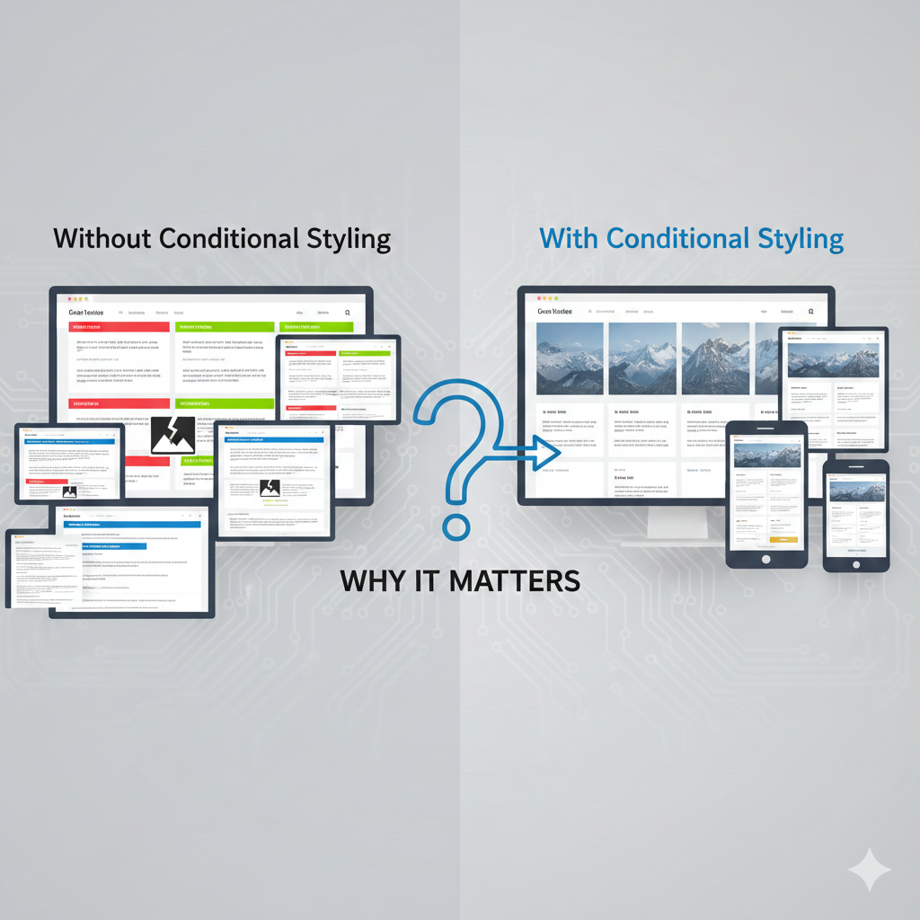
⭐ Why Conditional Styling Matters
Conditional styling helps users quickly understand data without reading every number. It improves:
✔ Data visibility
✔ User experience
✔ Decision-making
✔ Table readability
Good UI doesn’t just display data—it makes data clear and actionable.
1. Basic Conditional Cell Styling Using Inline Styles
The simplest way to apply conditional styling is by using inline styles inside the table cell.
Example
<TableCell
  style={{
    color: row.stock < 10 ? 'red' : 'inherit',
    fontWeight: row.stock < 10 ? 'bold' : 'normal'
  }}
>
  {row.stock}
</TableCell>
How it works
- If
stock < 10, the text becomes red & bold - Otherwise, it stays normal
This method is fast and works perfectly for small conditions.
2. Using sx Prop for Conditionally Styling Cells
MUI’s sx prop allows a clean styling approach.
Example
<TableCell
  sx={{
    backgroundColor: row.status === "Active" ? "#E8F5E9" : "#FFEBEE",
    color: row.status === "Active" ? "green" : "red",
    fontWeight: "600"
  }}
>
  {row.status}
</TableCell>
Why use sx?
- Cleaner and more MUI-friendly
- Supports theme values
- Easily customizable
3. Styling Based on Multiple Conditions
Sometimes you need more than one rule.
Example
<TableCell
  sx={{
    color:
      row.revenue > 10000
        ? "green"
        : row.revenue > 5000
        ? "orange"
        : "red",
    fontWeight: "bold"
  }}
>
  {row.revenue}
</TableCell>
Logic
- 10,000 → green
- 5,000 → orange
- Else → red
This is useful for financial dashboards and performance metrics.
4. Using Custom CSS Classes Conditionally
If multiple table cells share the same style, use conditional classNames.
Example
<TableCell className={row.status === "Failed" ? "failed-cell" : ""}>
  {row.status}
</TableCell>
CSS
.failed-cell {
  background: #ffebee;
  color: #d32f2f;
  font-weight: bold;
}
Benefits
- Cleaner UI code
- Reusable styles
- Great for larger projects
5. Conditional Styling in MUI DataGrid
Many developers use MUI DataGrid for advanced tables. It also supports conditional styling through getCellClassName.
Example
const columns = [
  {
    field: "stock",
    headerName: "Stock",
    width: 150,
    getCellClassName: (params) => {
      if (params.value < 10) return "low-stock";
      return "";
    }
  }
];
CSS
.low-stock {
  color: red;
  font-weight: bold;
}
Works best for
- Large tables
- Real-time dashboards
- Advanced filtering/sorting
6. Adding Icons or Badges Based on Conditions
Conditional styling isn’t just about colors—you can use icons too.
Example
<TableCell>
  {row.status === "Delivered" ? (
    <CheckCircleIcon color="success" />
  ) : (
    <PendingIcon color="warning" />
  )}
</TableCell>
This improves understanding at a glance.
7. Best Practices for Conditional Styling in MUI
✔ Keep logic simple and readable
✔ Avoid deeply nested ternary operators
✔ Use reusable functions for complex conditions
✔ Use className for large styling rules
✔ Test for accessibility—contrast & readability
Conclusion
Conditional styling in MUI Tables allows developers to build clean, intuitive, and highly interactive interfaces. Whether you’re highlighting stock levels, marking order statuses, or improving data visualization, MUI gives you flexible tools to style table cells based on any condition.