
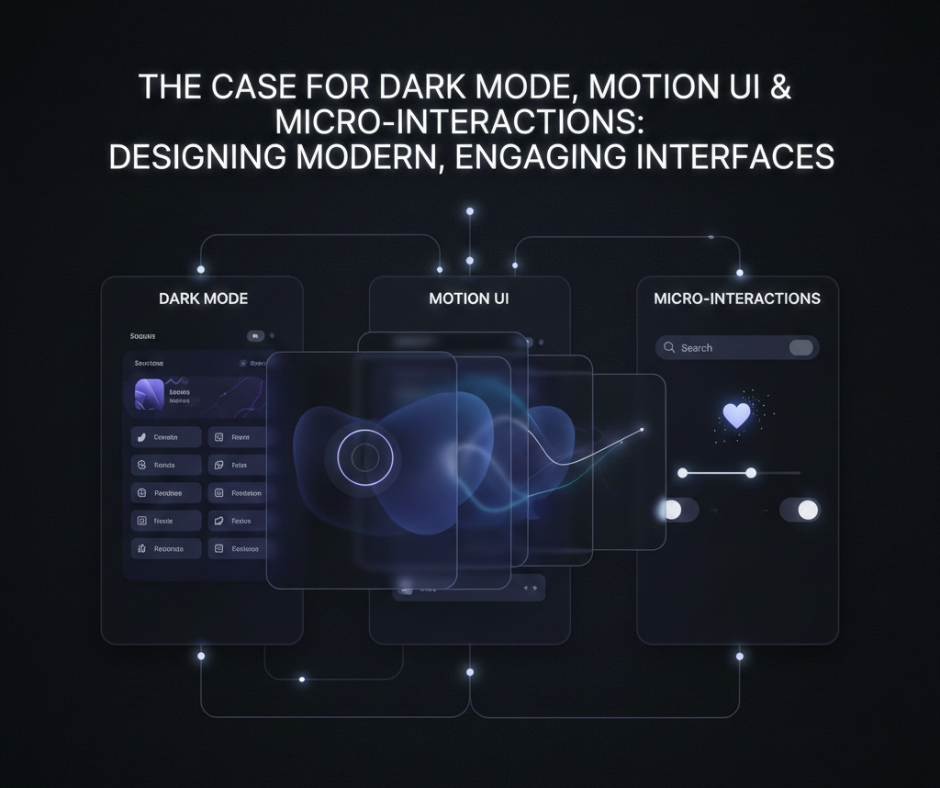
The Case for Dark Mode, Motion UI & Micro-Interactions: Designing Modern, Engaging Interfaces
User expectations for digital products have changed dramatically. Today, people don’t just want interfaces that work—they want experiences that feel smooth, intuitive, and visually satisfying. This shift is why dark mode, motion UI, and micro-interactions have become essential elements of modern interface design.
These features aren’t just aesthetic trends. When used correctly, they improve usability, accessibility, and user engagement. In this blog, we’ll explore why these design patterns matter, how they influence user behavior, and how designers and developers can use them thoughtfully in real-world projects.
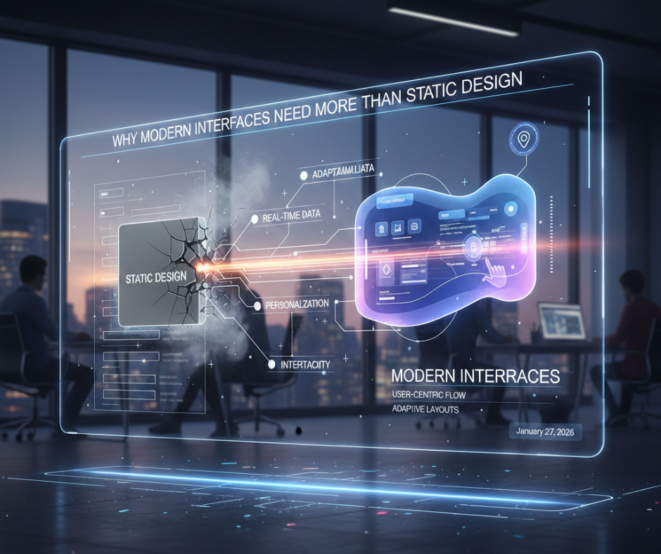
Why Modern Interfaces Need More Than Static Design
Static, lifeless interfaces often fail to:
- Guide user attention
- Communicate system feedback
- Create emotional connection
Modern interfaces respond, adapt, and communicate. Dark mode reduces visual fatigue, motion UI explains transitions, and micro-interactions provide feedback—all working together to create a human-centered experience.
Dark Mode: More Than Just a Visual Preference
What Dark Mode Really Solves
Dark mode isn’t simply about aesthetics. It addresses:
- Eye strain in low-light environments
- Battery efficiency on OLED screens
- Improved focus by reducing visual noise
For many users, dark mode is a comfort feature, not a trend.
When Dark Mode Works Best
Dark mode shines in:
- Developer tools
- Dashboards
- Content-heavy applications
- Night-time usage scenarios
It allows content to stand out while minimizing distractions.
Designing Dark Mode Properly
Poor dark mode design can reduce readability. Good implementations:
- Use dark grays instead of pure black
- Maintain sufficient contrast
- Adjust shadows and elevations
- Redesign colors—not invert them
Thoughtful dark mode design improves both usability and accessibility.
Motion UI: Helping Users Understand What’s Happening
What Is Motion UI?
Motion UI refers to purposeful animations that:
- Guide user focus
- Explain changes in state
- Improve navigation clarity
Instead of being decorative, motion becomes functional.
Why Motion Matters
Without motion:
- Transitions feel abrupt
- Users get lost
- Interface changes feel confusing
Motion UI helps users mentally map interactions, making interfaces easier to learn and more intuitive.
Good Uses of Motion UI
Effective motion UI includes:
- Page transitions
- Loading indicators
- Modal animations
- Expanding or collapsing elements
When subtle and intentional, motion adds clarity—not distraction.
Micro-Interactions: Small Details, Big Impact
What Are Micro-Interactions?
Micro-interactions are tiny UI responses triggered by user actions, such as:
- Button hover effects
- Toggle animations
- Form validation feedback
- Success or error indicators
They answer a simple question: “Did my action work?”

Why Micro-Interactions Matter
These small details:
- Increase user confidence
- Reduce frustration
- Make interfaces feel alive
- Build emotional engagement
Users may not consciously notice them—but they feel their absence.
Where Micro-Interactions Work Best
Micro-interactions shine in:
- Forms and inputs
- Buttons and icons
- Notifications
- Progress indicators
They turn routine actions into satisfying moments.
The Psychology Behind These Design Patterns
Dark mode, motion UI, and micro-interactions succeed because they align with how humans process information:
- Visual comfort reduces cognitive load
- Motion helps the brain track changes
- Feedback reinforces user confidence
Together, they create interfaces that feel responsive and empathetic.
Balancing Engagement with Performance
One common concern is performance. Overuse of effects can:
- Slow down interfaces
- Distract users
- Hurt accessibility
Best practices include:
- Keeping animations short and purposeful
- Respecting reduced-motion preferences
- Prioritizing clarity over flair
Good design is about restraint, not excess.
Why These Features Matter for Designers & Developers
Including dark mode, motion UI, and micro-interactions in your projects shows:
- Attention to detail
- Understanding of user experience
- Awareness of modern design standards
For students and freelancers, this can significantly elevate portfolio quality and make projects feel production-ready.
Common Mistakes to Avoid
- ❌ Treating dark mode as a simple color inversion
- ❌ Adding animation without purpose
- ❌ Overloading interfaces with effects
- ❌ Ignoring accessibility considerations
Modern UI design should feel effortless, not overwhelming.
The Future of Interface Design
As AI, personalization, and adaptive interfaces evolve, these design patterns will become even more important. Interfaces will increasingly:
- Adapt to user preferences
- Respond intelligently to behavior
- Communicate clearly through motion and feedback
Dark mode, motion UI, and micro-interactions are foundational elements of this future.
Conclusion
Modern, engaging interfaces are built on more than layouts and colors. Dark mode enhances comfort, motion UI improves understanding, and micro-interactions create emotional connection.
When used thoughtfully, these elements transform digital products from static tools into delightful experiences. Whether you’re a student, designer, or developer, mastering these concepts isn’t about following trends—it’s about designing interfaces that feel human.
In a world full of apps and websites, the ones that feel right are the ones users return to.